Book Comparison - Designing for Large Screen

Introduction
In our ‘Interface and experience design’ class, we were asked to design an interactive prototype for a large Prysm touchscreen (3840 px X 2160 px ) and we had two weeks to conceptualize, build and evaluate the prototypes. Designing for a large touch screen is very different from previous projects that we did. In this case, the user is expected to stand in front of a screen in a public space where people are talking or walking around. This special user context is actually the key to the project. This project, therefore, has strongly changed our understanding of designing and testing in a real-world context.
Project Overview
Keeping in mind the task of designing interaction that helps library patrons accomplish a goal in the context of the library we did research and came up with the idea of book comparison. To make something meaningful, we had to consider the context and how will the project ultimately be used. The idea was to design an intuitive application that helped students visiting the library to compare and find the book which matches to their interests in a particular area of study or domain. This would solve the problem of the students visiting multiple racks and sections to find out the book which they are exactly looking for.
Things we considered before designing for large touchscreen
I knew that the screen size is about 10 times larger than that of the average smartphone and that this significant difference in size has a real impact on user behavior. I observed the following things before jumping into the design.
Hand Movement
I realized that facing a larger screen size significantly increases the interaction efforts of tapping, typing, and moving between screens. Users are more likely to access the interface at extended arm’s length and must hold their hands in the air, which increases fatigue.
Eyes Scanning
Using smartphones, users can take in the whole screen at one glance. With a large screen, they must move their heads around to see all parts of the interface, which requires more efforts from users
The matter of privacy
With a large touch screen, there is usually enough space for two or three people to interact at the same time. The negative side to screen sharing is that it offers little or no privacy for users of the large, public touchscreen. With big touchscreen design, requiring users to provide sensitive information is problematic.
Process Overview
I followed the double diamond iterative approach, through a loose, lean, process we managed to find calm from chaos and success while confronted with the unknown. Research, interaction modeling, prototyping, contextual user testing, and iterative design all contributed to the success of our first phase.

Research
Based on the root concept and intended users (target audience), we conducted traditional interviews and contextual inquiries. Traditional interviews were used to gather basic information about what problems do library patrons face. Contextual inquiries were conducted to gather activity information in the context of the defined problem. All the answers and data gathered was collated to identify obstacles, patterns and activity preferences of the users. Traditional interview questions that we asked were :
- What is your primary purpose of coming to the library?
- How much time do you spend in the library or on the library website?
- What problems do you face in the current library system?
- What are the key library tasks you don’t mind sharing with someone?
Exploring ideas and Sketches
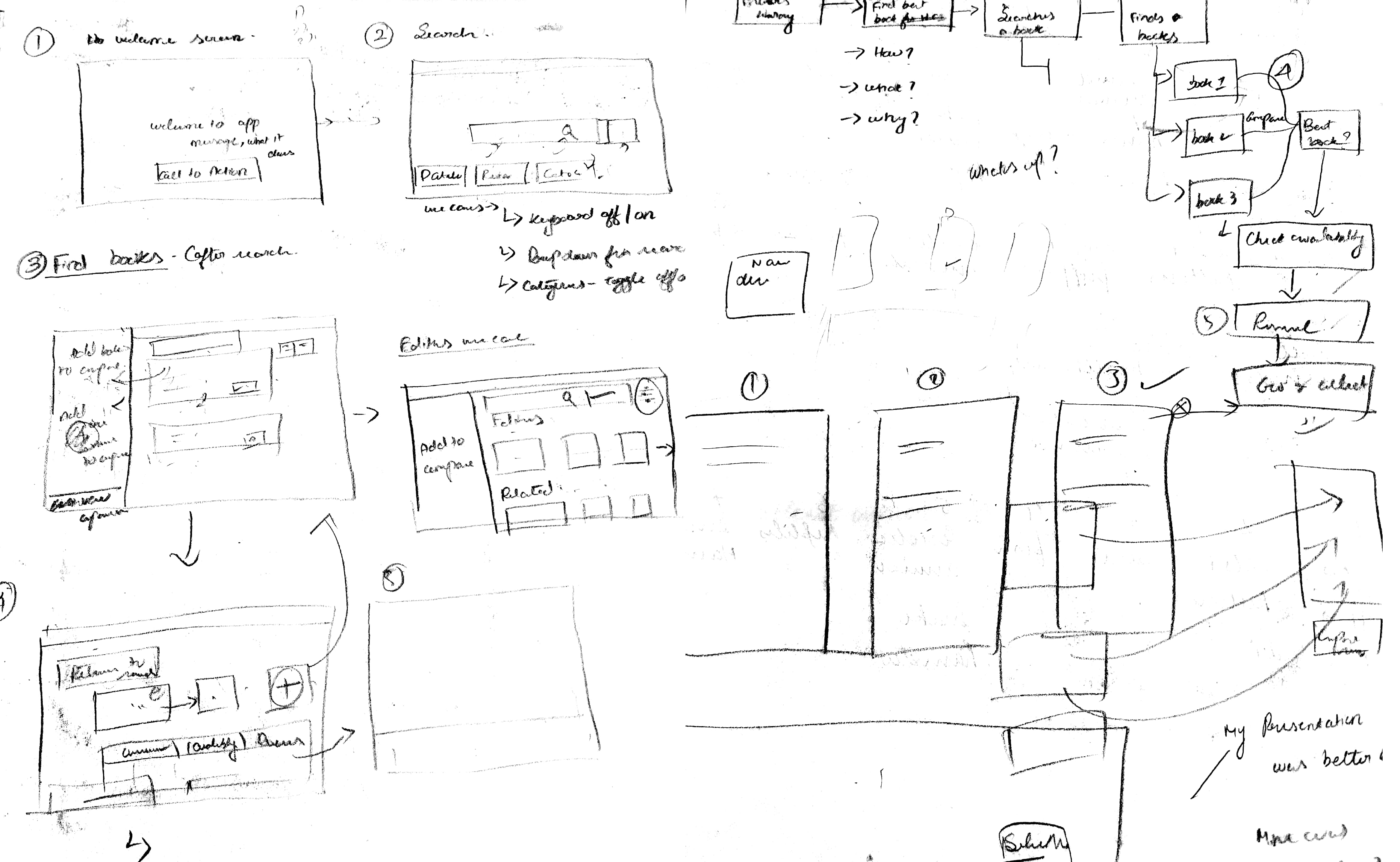
Keeping our audience research in mind, brainstorming and plenty of whiteboarding, we kicked off our initial approach. Beginning with user journeys and user flows provided clarity into our mindset and behavior within the physical space. I drew paper sketches, whiteboard flows and wireframes to validate our initial concepts and ideas.
Prototypes
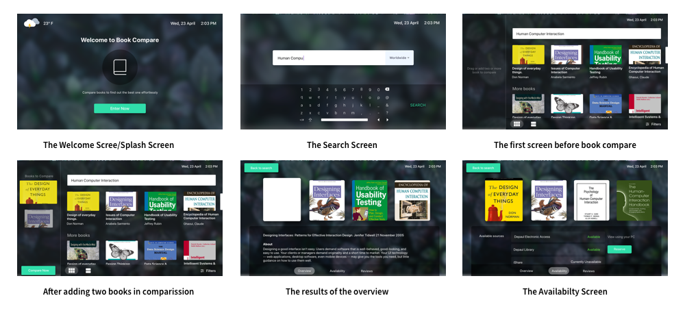
Once we narrowed down the sketches, the next part was to bring out the ideas alive in the digital interface. I examined several tools which would satisfy the needs of interactions we planned for the prototype. After trying out several tools, we used a tool called “Principle” for prototyping because of the gestures and the interactivity it offered. I were able to create interactions in the way we expected it to behave using this tool quickly. I created a few prototypes and tested it right on the screen to evaluate several factors like usability, affordance, and interactivity. Once we narrowed down the final prototype we added micro-interactions to make the application more intuitive and made it act like a working model. I kept everything ephemeral but efficient at the same time.
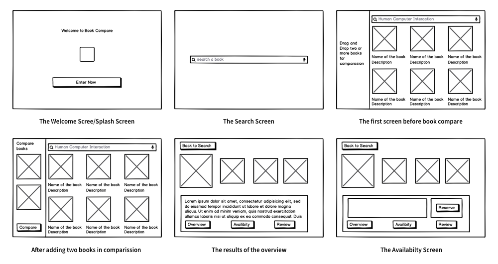
Our Initial Prototypes
1. Welcome Screen
I designed the welcome screen in a way that it has a prominent call to action to enter the application. I used our primary color to create a call to action button
2. Search for books
The main use case of the application was to search for a context or domain in order to find books so we made a prominent placeholder to search and a simple view to avoid clutter.
3. Search Results
I displayed Search results in the grid style with the book covers to give a feeling of excitement and curiosity for the user and to cover the wide space without neglecting the white space.
4. Add to Compare
Because it is a touch screen and users tend to drag items we made intuitive interaction drag interaction for adding to the comparison.
Ability to easily switch to know about the various aspects of the book by providing at the bottom. Back to search placed at the top to segregate it apart from the actions in the screen.
User Testing
I used a predetermined script for the testing process and upon obtaining formal consent from test users, we achieved test results for following key tasks
- Please search for books with the domain “Human-Computer Interaction”
- Compare the first three books in the list of books
- Preview the first few pages of the book
- Check the overview, reviews, and availability of the book
- Reserve the book
The idea for this user testing was to figure out if the participants were able to finish the given tasks. I did a usability study and cognitive walkthrough for testing our prototypes. A usability study was conducted with real-time users (our classmates). A cognitive walkthrough was done in which users worked through a series of tasks and were asked questions based on that. The focus was to understand the system’s learnability for new or infrequent users.
Changes Made After User Testing
After initial critics and walkthroughs, we realized there are a few things that need to be changed in order to come up with a good task flow. I made the following changes to the interfaces.
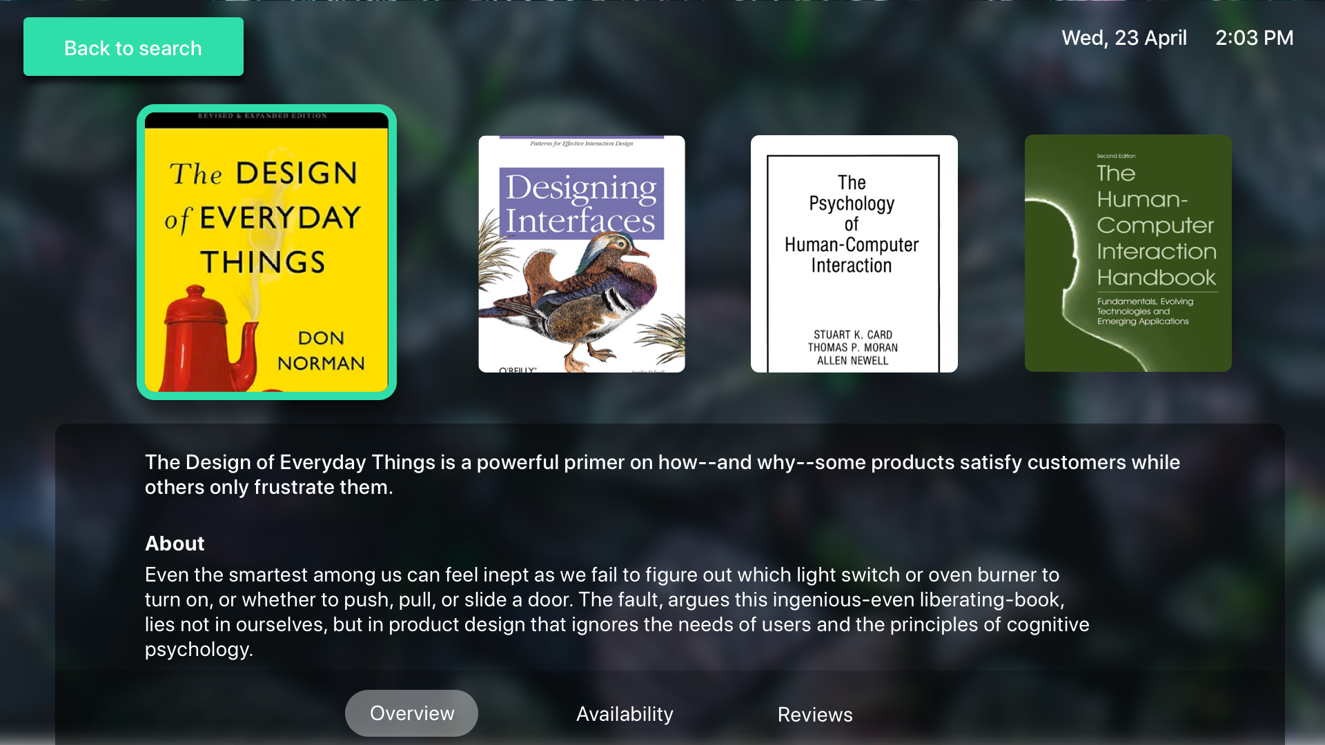
- Users were unable to differentiate the selected book in the comparison screen, we fixed that by adding a UI element of colored border to distinguish it from the rest of the books
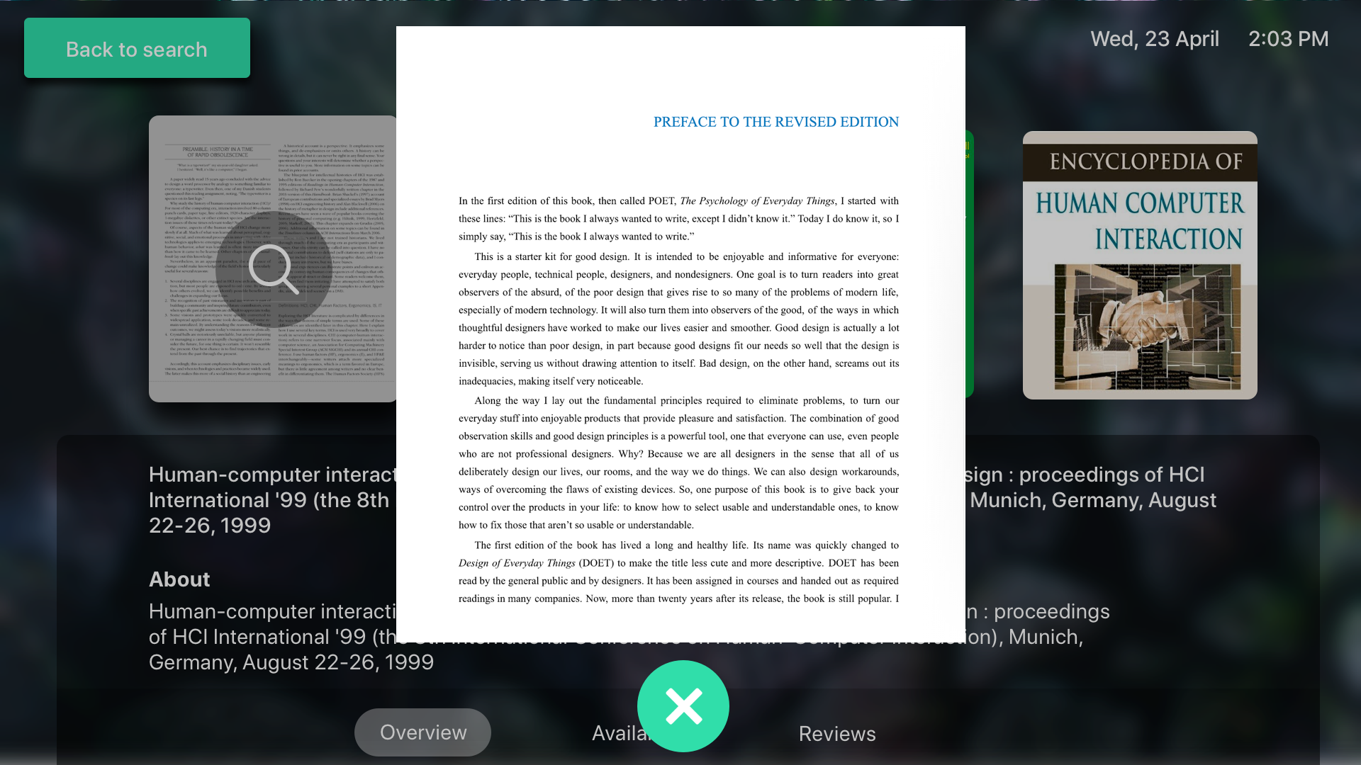
- The book preview was small when viewed on the large screen and it was tough to determine that the pages can actually be swapped, so we fixed this by enlarging the sample preview in full screen and adding a close button in its center, in case the user wants to quit that screen.
1. A better way to preview sample pages
Taking in the user feedback of offering a bigger space for preview, we re-iterated to maximize the size of the sample preview in a separate view.
2. Conveying the selected book in a prominent way.
Increasing the prominence with a border to differentiate the selected book with the other books in comparison.
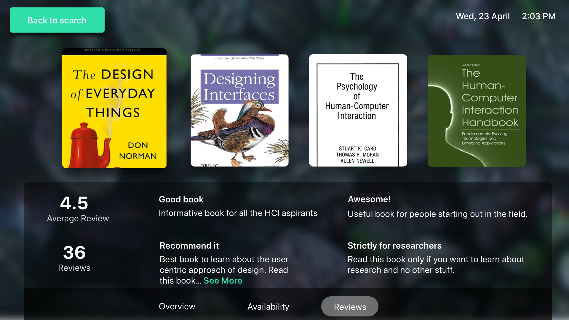
Improvement: More lines of review with see more
Final prototype Video
Learnings
In this project of designing for the large screen we learned that :
- Users were a little shy and timid to begin to interact; they felt like they were on full display standing in front of such large screens
- Users read less — they wanted to poke, tap, drag, and swipe. In many cases, the rational mind goes right out the window
- When an interaction triggered an event, we had to rely heavily on the motion to grab the user’s attention or they would completely miss it
- Users leaned forward to interact but stepped back to read and digest
- Users leaned forward to interact but stepped back to read and digest
