Outfit of the Day - A Virtual Closet Application

Overview
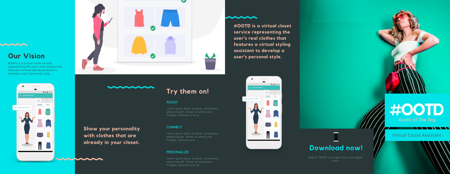
Outfit of the day is a virtual closet service representing the user’s real clothes that features a virtual styling assistant to develop a user’s personal style. The application tracks a user’s wardrobe and outfit habits to make intelligent suggestions on potential outfits. Information on the user’s current wardrobe is fed in the system. Users can create an avatar to model outfit combinations without having to go into their closet and try on or remove clothing. The application also helps users plan outfits throughout the week and for special occasions.
My Role
Team lead (Team of 4)
Skills
UI/UX,Wireframe, Research
Duration
4 Weeks
Tools
Axure, Sketch, Photoshop
My Role
I worked as a UI/UX designer on this project. Some of my responsibilities included :
- Planning, defining scope and strategy
- Conducting user interviews and observations
- Facilitate ideation and design decisions
- Sketching, wireframing and prototyping
- User testing and evaluation
- Making changes after obtaining results from User testing
Process
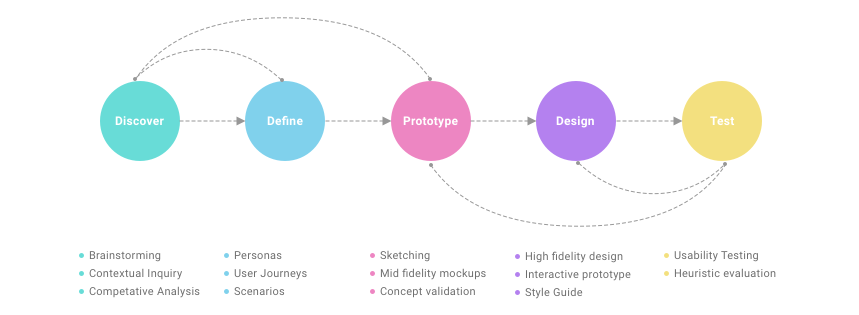
Information Gathering - Analysis Phase
The design process started with the analysis phase which further had sub-activities such as contextual inquiry, contextual analysis for studying user behavior, from which gathered the needs of our system. We extracted requirements from contextual data. The requirements included interaction design requirements, inputs driving the design process for us to determine the features, look, feel and behavior of the interaction design.
It also shows recommended organization based on the user profile as I want to encourage the user to join more organizations.This will ensure that there is no conflict of interest and increases the chances of students getting involved.
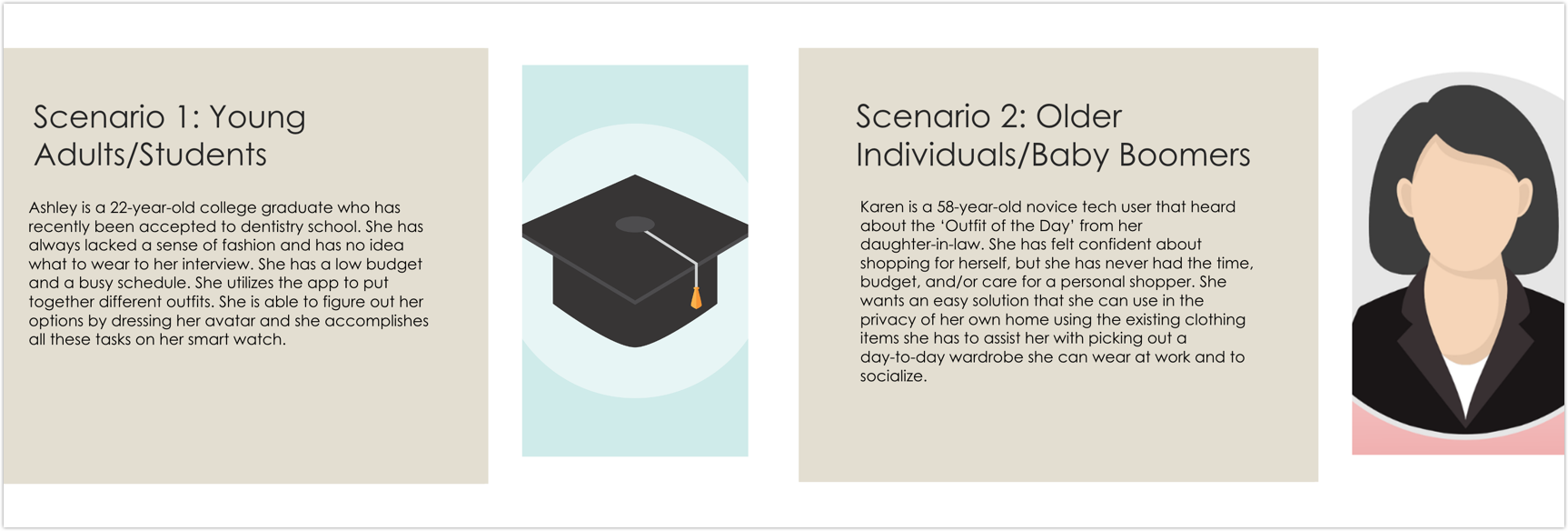
Target Audience - Personas And Scenarios
We identified four personas of different segments of individuals who might use our application. We did place “Men” in a single category because we felt that segment, as a whole, would be less likely to use the application. However, we would need to do more research to accurately determine that decision. The other three categories are 1) Young Adults/Student, 2) Baby Boomer, and 3) Busy Parents of Young Children
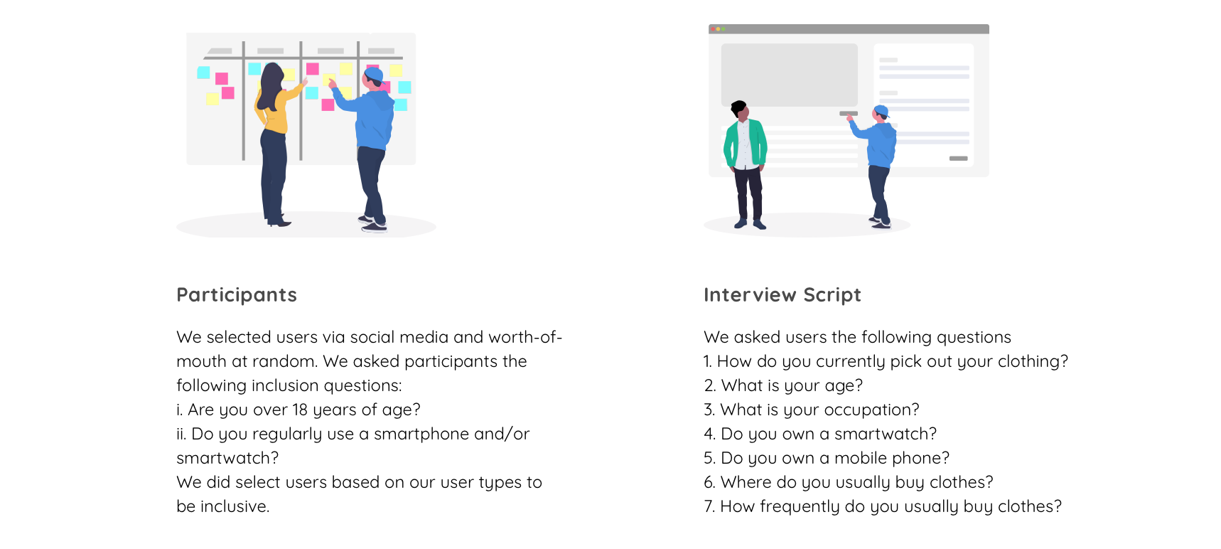
Interviews and Observations
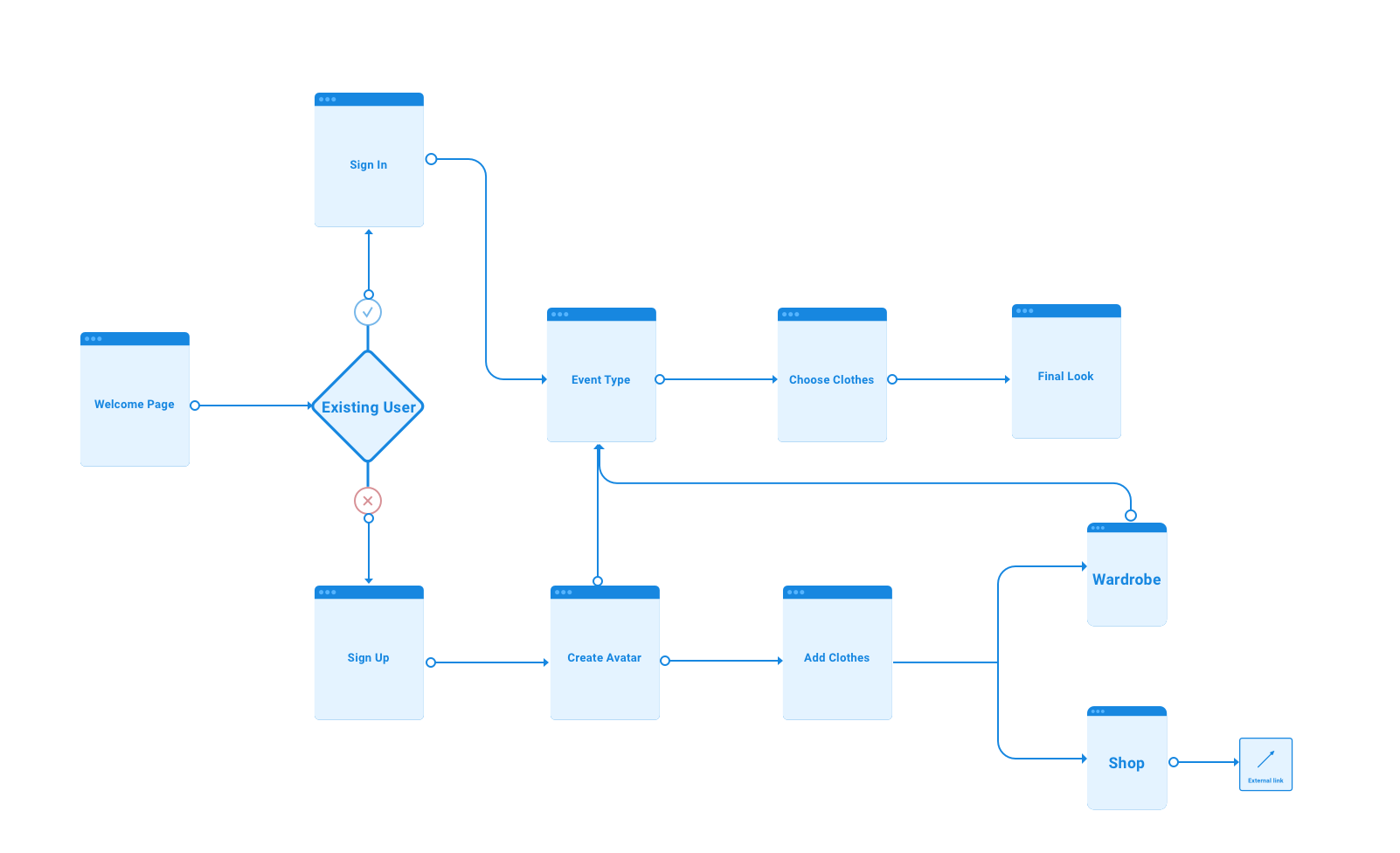
User FLow Diagram
Ideation And Sketching
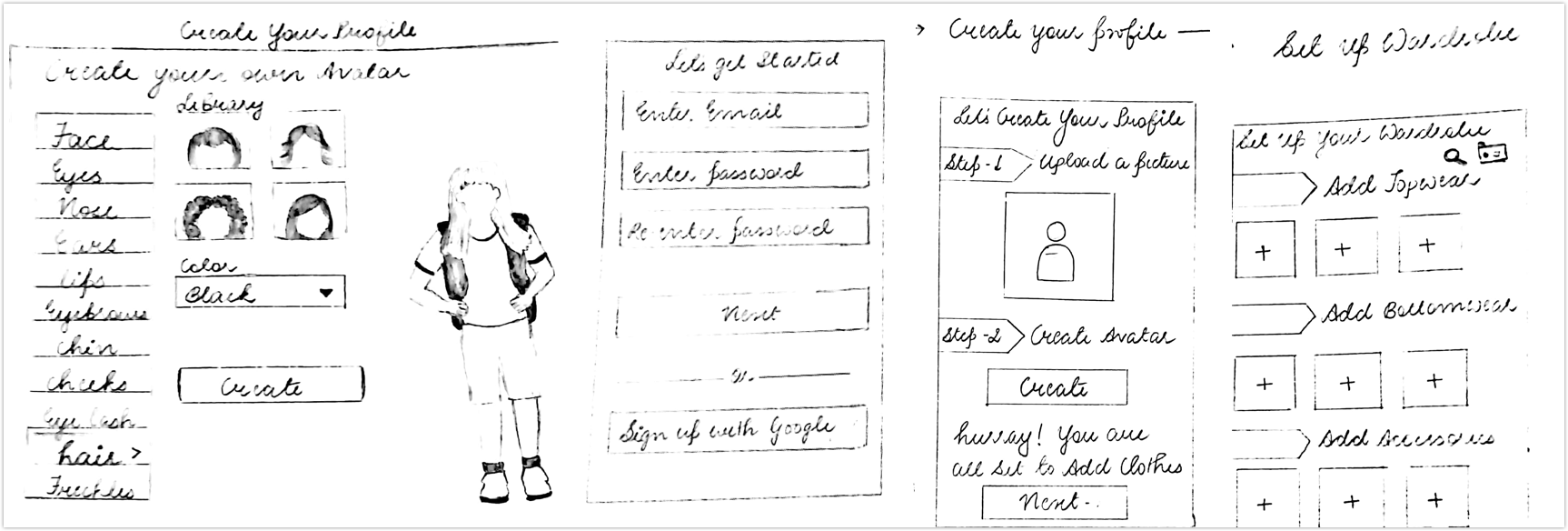
Our team analyzed the data that was gathered from contextual inquiry and began to brainstorm. We started the interaction phase with sketching so that it can be done and redone multiple numbers of times as required. We knew that it is easy to sketch ideas using pen and paper and validate them from test users before jumping into prototypes.
Design Implementation
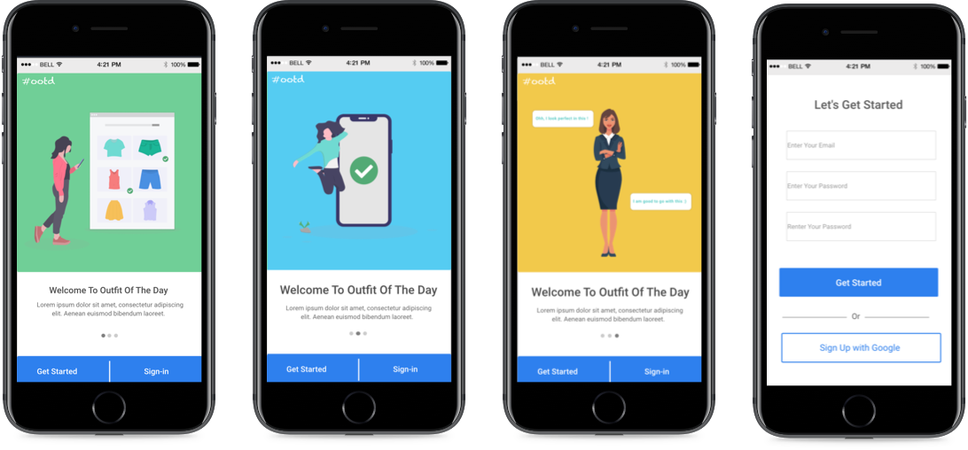
I made the prototypes using a tool called Axure. Once the user downloads the app, they will be directed to the login page. On this page, they will be required to fill out the necessary information in order to proceed. User’s will also have the option to create an account by signing up with Google. Once an account has been created, the user can upload their picture and customize their avatar.
Home Screen
We knew that mobile users are very goal-oriented and super impatient. We wanted to avoid distracting users from their goals. So we decided to keep our homepage and top landing pages simple. We made sure that we have a clear call-to-action and a value proposition above the fold.
Feature list
Customizing avatar is the next step, it is very important step as this will determine how each outfit looks on an individual. This is a one time task for users to customize their avatar to resemble them in real life. Users will be able to add pictures, scan tags or search for their current wardrobe. This is an efficient way for users to update their wardrobe on the app. The app will be able to determine an appropriate outfit suggestion once the user filters out the following. The app will display various suggestions from the users wardrobe. Users will be able to swipe through these options. You can preview here https://lknrrd.axshare.com/#g=1&p=home_screen-1

Marketing Materials
Usability Testing
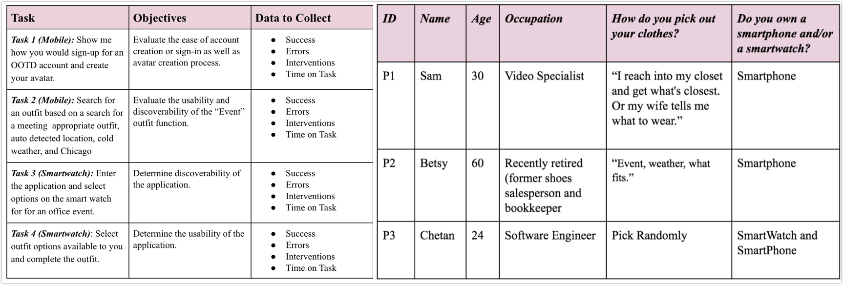
The purpose of this test plan was to observe the behaviors of a subsection of representative users while performing tasks for both desktop and mobile channels. We have created mid-fidelity prototypes in Axure and created four tasks to be observed. Which included the following tasks.
Findings
The data collected shows the users were mostly able to sign up and customize their avatar easily. Additionally, participants wanted to be able to customize the avatar more. The users who identified as men were not able to use the masculine avatar. One user wanted to play with customizing their avatar.Testers remarked that there was not an easy route to get to the customization by event type area. However, they found the process easy once they arrived.
Reflection and Learning
Working on this project gave us a very important experience that to make the design process a success it is essential to understand the user goals and use that understanding in the creation of a design solution. Asking real users helped us in improving bits and pieces of the whole project. It is an iterative process. In the end we were able to build a product that is super easy to use and really helpful.
